
Windows 20 stunning design Exposure awesome: Windows 10 should look like this!
Windows 20 stunning design Exposure awesome. Netizens make Windows 20 awesome: Windows 10 should look like this!. There are many places where Windows 10 is tearing. Regardless of the user interface design or functional characteristics, there are many places that can be improved. Netizens continue to offer Microsoft their suggestions and ideas for creating their own conceptual design.
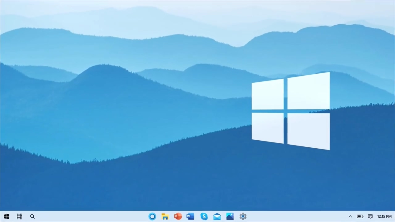
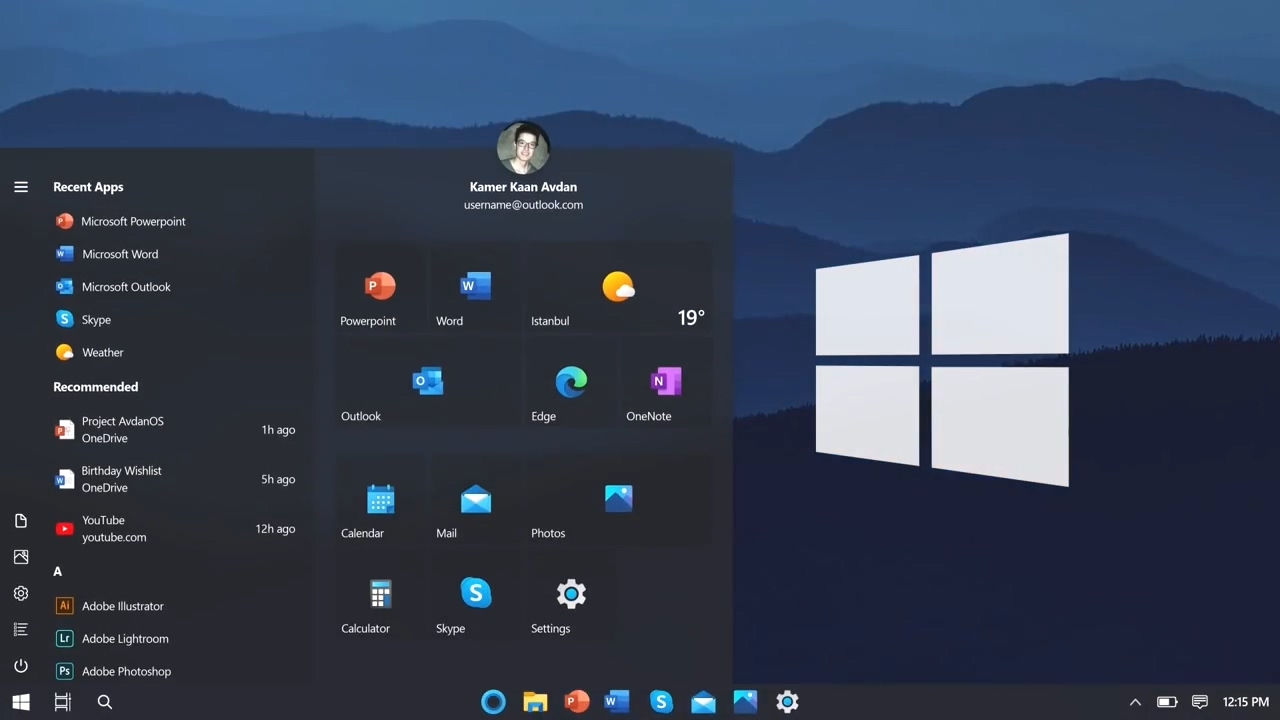
According to the conceptual design changed all the angles of Windows 10. In this design including the taskbar, Start menu, Explorer, settings, tablet mode, action centre, dark night mode, search, live wallpaper, etc. And call it “Windows 20”.
The Windows 10 taskbar also supports many settings, but Advan has added more and more flexible options. Especially the taskbar icon can be selected in different positions, such as the centre, left, etc. The icon supports hover colour, even the menu icon ” Start ”can be hidden. There are also various display modes for dark and light colours.
In the Start menu, the dynamic tile is mostly customizable. When you hover over a pop-up context menu. It is similar to the effect of a long press on the icon on a mobile phone. The parameters of different programs are different, for example, PowerPoint will open a new, open, recent, shared, Outlook New messages, new events and calendars will appear.
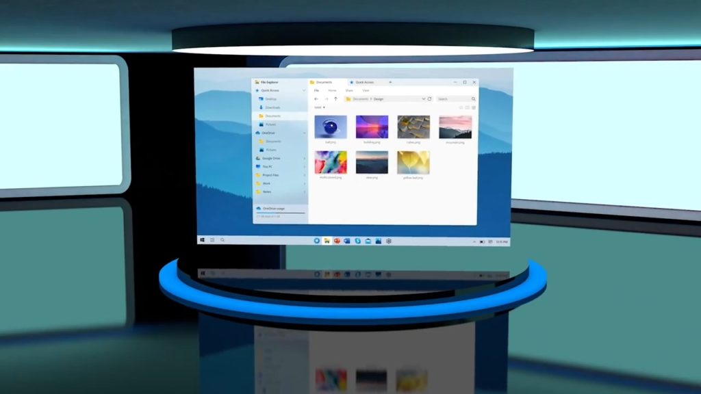
The entire resource manager interface has been updated. The layout has become more reasonable and attractive, and a multi-tabbed view mode has been added, which has been called up for many years.
The installation program
On the one hand, adds information about the status of the account, OneDrive cloud drive, recorder, Windows updates, etc. On the other hand, it completely abandons the traditional control panel and combines all the parameters, which is very convenient.
In tablet mode, the bottom prompt line is added, similar to iOS, and the program icon can be called up by swiping up.
The action centre reorganized notifications and quick settings: it’s not only more convenient to adjust the brightness and volume, switch Wi-Fi, Bluetooth, etc. but also adds a colour mode, optionally bright, dark, dark three modes, support for automatic time display when switching status bar, start menu, etc. will automatically change accordingly.
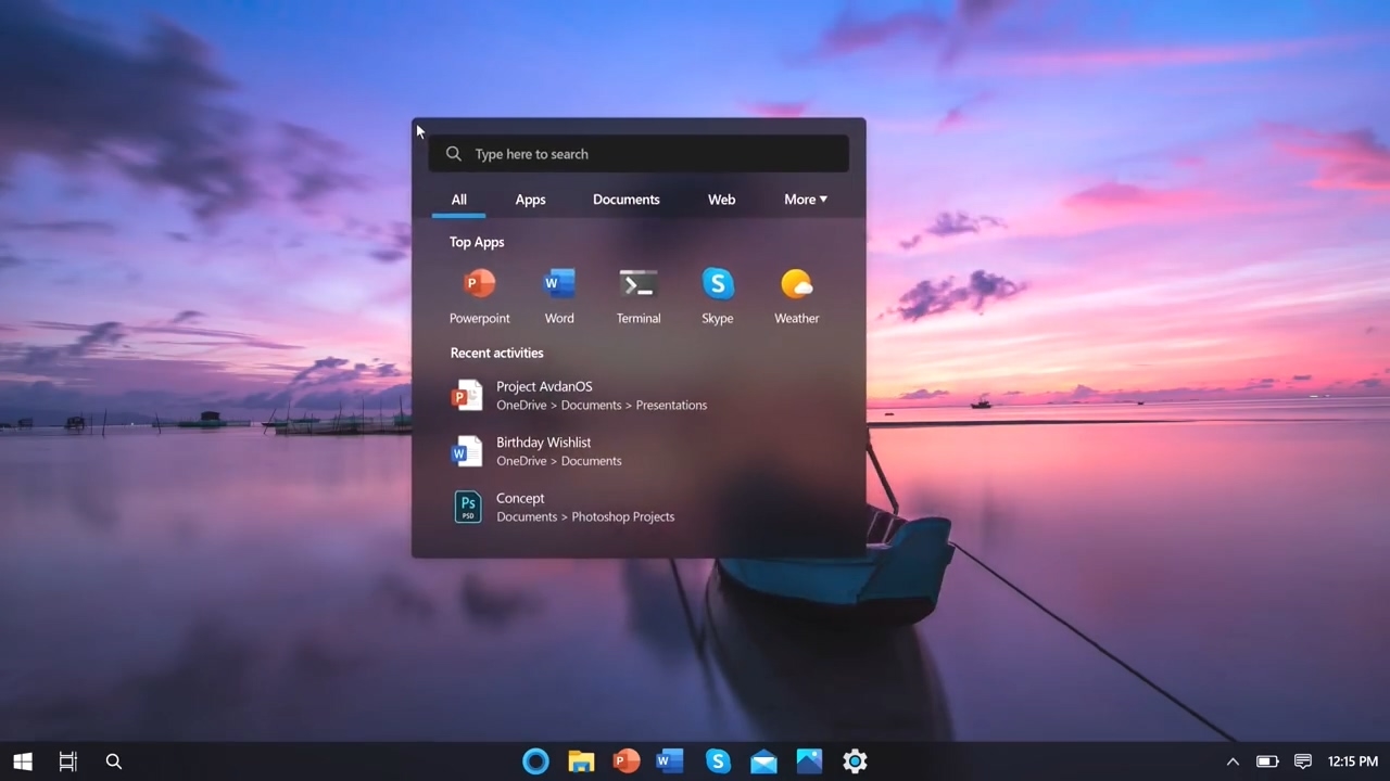
Search is where Windows has always worked poorly. After the redesign, you can search in different categories, and the results are more reasonable.
There are also dynamic wallpapers that will switch between different wallpapers depending on the time, such as blue sky during the day and starry sky at night.
Windows 20 stunning design Exposure awesome. Netizens make Windows 20 awesome: Windows 10 should look like this!. There are many places where Windows 10 is tearing. Regardless of the user interface design or functional characteristics, there are many places that can be improved. Netizens continue to offer Microsoft their suggestions and ideas for creating their own conceptual design.
According to the conceptual design changed all the angles of Windows 10. In this design including the taskbar, Start menu, Explorer, settings, tablet mode, action centre, dark night mode, search, live wallpaper, etc. And call it “Windows 20”.
If Windows 10 becomes like that, who would not like it?
Also Read:
The United States announced the PSV photos of the COVID-19 new coronavirus: like sausage pizza
iPhone 12 Pro little bangs secretly announced: Apple’s technology upgrade, screen ratio increased
iPhone 12 Emperor Edition exposed! 3 cameras + radar / ultra-narrow bezel